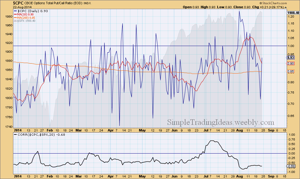
The CBOE Options Total Put/Call Ratio confirms the recent advance of the overall market. Investors are buying less puts as they believe that the market could move even higher. The daily chart below shows $CPC with a couple of moving averages. The 10-day SMA sharply turned down and is moving lower. The correlation coefficient between $CPC and $SPX the S&P 500 index is back to normal which is negative.
0 Comments
$VIX sharply moved lower during the past week showing that investors are having more confidence in this long-term uptrend and the recent "fear" of a deeper correction is now in the past. Even sudden geopolitical events only moderately affected the market as it was evident this past Friday and it was quickly absorbed showing how resilient is this equity market. $VIX spiked above the 200-day moving average but finished the day below that as fear dissipated during Friday.
The daily charts below shows $NYA, the NYSE Composite Index. The indicator window shows the New 52-Week Highs and New 52-Week Lows of the NYSE. I am trying to use these breadth indicators to gauge the bottom of this pullback/correction. The New 52-Week Highs are still way under the 50-day SMA and the New 52-Week Lows are still above the 50-day SMA and increasing. There was a similar situation back in February, see the circled areas. I am still waiting until the New 52-Week Highs are increasing and eventually move above the 50-day SMA and the New 52-Week Lows move way below the 50-day SMA.
The daily chart below shows $SPXA50R, the S&P 500 Percent of Stocks Above the 50-Day Moving Average. It has been declining since the end of June showing a divergence with the S&P 500 index. You can read more about the $SPXA50R if you search this site. The horizontal lines are for reference. The upper half is bullish and the lower half is bearish. During pull backs $SPXA50R can decline below 40%. In an uptrend this could be a good buying opportunity.
The daily chart below shows SPY, the S&P 500 SPDR ETF with two indicators below the chart. Both indicators show signs of weakness. MACD is below its signal line and the Vortex indicator shows that both the positive and negative trend indicators are below 1.0 and they are almost equal.
The daily chart below shows SPY, the SPDR S&P 500 ETF representing the Large-Caps. SPY was overbought recently as you can see in the indicator window above the chart and it's not a surprise if SPY moves lower or sideways in the short-term. MACD also looks like ready to cross below the signal line. For the next support level we can use Fibonacci retracement levels, most likely the 50-62% levels and the 187.60 level (red line). SPY crossed this level several times during the past couple of months.
The market carpet below shows 265 stocks in the S&P 500 where the 25-period Weekly Aroon Up trend indicator is larger than 70. The market carpet shows how these stocks performed during the past week.
Tha daily chart below shows SPY, the S&P 500 ETF with the daily and weekly Aroon trend indicators in the indicator window. The shorter period Aroon represents the daily trend and the longer period the weekly trend. Currently Aroon Up is 100 for both of them.
There are three daily charts below of three different breadth indicators. These three indicators don’t seem to support a possible upside breakout in the near future. First let’s start with $SPXA50R. This breadth indicator tells us the percentage of S&P 500 stocks Above their 50-day Moving Average. You can read more about this breadth indicator here. This indicator has been moving lower creating a bearish divergence. Over 40% of the stocks in the S&P 500 are below their 50-day moving average. See the chart below. This next chart shows $BPSPX, the S&P 500 Bullish Percent Index. $BPSPX is a breadth indicator showing the percentage of S&P 500 stocks with Point and Figure buy signals. A Point and Figure chart either gives buy signal or sell signal. Read more about $BPSPX here. Over 30% of the S&P 500 stocks are on a P&F sell signal. See the Chart below. The third chart shows the NYSE McClellan Oscillator, $NYMO. This breadth indicator is calculated from the Net Advances on the New York Stock Exchange. Net Advances are the number of Advancing Issues less the number of Declining Issues. You can read more about $NYMO here. $NYMO has been pretty flat since March, not showing much enthusiasm among buyers or sellers.
The Chaikin Oscillator measures the momentum of the Accumulation Distribution Line. The calculation is similar to the calculation of MACD but instead of the price it uses the Accumulation Distribution Line. It is an indicator of an indicator. The Chaikin Oscillator is the difference of the 3-period EMA and the 10-period EMA of the Accumulation Distribution Line. Similar to other momentum indicators, it is designed to anticipate directional change in the trend as momentum change usually precedes trend change. The calculation uses both the price and volume since it is based on the Accumulation Distribution Line. The Chaikin Oscillator gives buy/sell signals by bullish/bearish divergences and centerline crossovers. The chart below shows the weekly chart for SPY, the S&P 500 ETF with the Chaikin Oscillator in the indicator window (the chart also shows the 20-period Price Channels). There was a noticeable bearish divergence since last year Novermber and the Chaikin Oscillator finally crossed below zero at the end of March. That is considered a sell signal according the Chaikin Oscillator. The Accumulation Distribution Line is falling and selling pressure dominates.
|
Loading
Search Site
Links
Archives
September 2014
Categories
All
|